A data journalist created an interactive map that allows individuals to see how property values changed between 2008 and 2012.Photo Courtesy Vizynary
Where is it affordable – or drastically not so – to live in New York City?
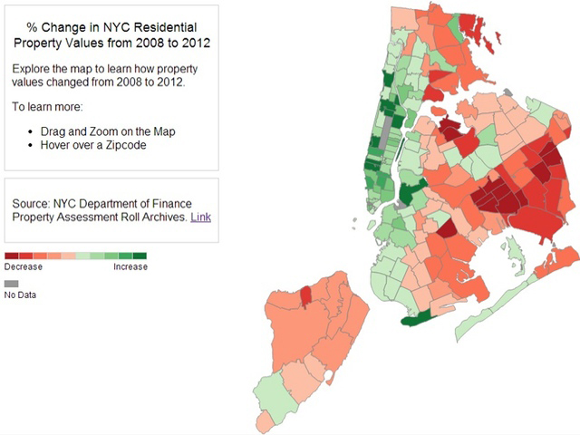
Data journalist Chris Walker recently analyzed market value changes on close to 1 million properties throughout the five boroughs to create an interactive map that allows residents to see the rise and fall of property values around the city from 2008 to 2012. The end result is a fascinating account told through numbers of a story of urban migration, an economic downturn and the devastating impact of home foreclosures.
After combing through data from the city Department of Finance, Walker published the map at the end of October on his blog, Vizynary.com.
“I know a lot of New Yorkers almost love to complain about the seemingly relentless rising of prices, and so I wanted to add some fact to those complaints – and challenge the assumption it holds true anywhere in NYC,” wrote Walker, who studied economics at Stanford and lived in Manhattan before recently moving abroad with his girlfriend. “Housing affordability is a major issue for the mayoral election, and I also wanted to add my own original research to the conversation leading up to it.”
As for what Walker found, property prices throughout much of Queens declined during those four years – 2008 to 2012 – while, expectedly, parts of Manhattan and western Brooklyn have experienced dramatic price hikes that are in part the result of mass gentrification.
Property prices dipped throughout South Queens, with South Ozone Park and South Richmond Hill properties declining by about 22 percent and Woodhaven prices dropping by about 23.5 percent. Ozone Park dropped by about 20 percent, while Richmond Hill fell by about 18 percent. Howard Beach experienced the smallest decline in South Queens, about 5.9 percent.
Neighborhoods in mid-Queens also dropped, though not as dramatically as in the borough’s southern region. Often accused of becoming the next Williamsburg, Ridgewood did not experience anything close to the trendy Brooklyn neighborhood’s spike in prices – it dipped by about 8.7 percent. Williamsburg, on the other hand, seemed to spiral out of control, with its property prices skyrocketing by 175.8 percent.
Queens neighborhoods that did see an increase included Forest Hills – 1.2 percent, parts of Flushing, and portions of Astoria. Many of the borough’s upscale northern neighborhoods too saw a decrease in prices, with Bayside declining by about 0.7 percent and College Point dropping 7.4 percent. Southeast Queens – which was hammered with foreclosures – too saw steep declines.
“There’s a lot of data out there – and a lot we can learn from it, if it’s presented in relevant and focused ways,” Walker wrote. “When I published this map I was hoping that people would use it to think more critically about housing affordability, and to wonder why the map looks the way it does, not just to complain about their neighborhoods being over-priced.
“I do think the differences shown on the map have something to do with increasing inequality, and with foreclosures since 2008 disproportionately affecting minority homeowners in poorer neighborhoods,” Walker continued. “I think these issues need to be openly discussed, not just before the election but after it too.”
The data journalist, who previously worked for a tech company based in Silicon Valley called Palantir Technologies that makes analysis software used in counterterrorism, combatting bank fraud, and even for Hurricane Sandy relief, said he expects the city will have to focus on making neighborhoods more attractive places for people in order to boost property prices.
“That means more economic opportunity/jobs, incentivizing more small businesses to take root, ensuring better access to city services,” he wrote. “In this scenario prices would rise only gradually because it takes a long time to fix these problems.
Walker said he is particularly concerned about the transformation of Brooklyn neighborhoods like Williamsburg and Bushwick – where prices shot up – and what that means for nearby areas, including in Queens.
“Opportunistic property developers could snap up bargain properties in Queens with the intent of fixing them up and making them livable for young professionals and urban elite,” he wrote. “In this case, property prices would increase more quickly, but the lower and middle classes would be priced – and pushed – out of the neighborhood.”
To see the map, go to: http://vizynary.com/2013/10/30/where-in-new-york-city-has-property-become-more-expensive/
By Anna Gustafson